Open Your Social Media “Cabinet of Curiosities”

Two of the best rules for a great social media strategy are: 1) Always have a visual; and 2) Change up your posts. That means catching the reader’s eye and keeping things interesting with different types of content.

For images, you need “thumb-stoppers” that make your readers stop scrolling their phones and read your post. But finding those visuals is easier with some types of posts than others.

Let’s look at different types of posts and the kind of images they tend to rely on. Three types are:

  • Direct promotion of a product or business to drive sales or donations. Images could include photos of products or a nonprofit’s clients.
  • Shared content from other sources that educates and shows you’re on top of trends. These generally come with images.
  • Entertaining or engaging content that shows who you are and helps people relate to your business or group. This is where you see memes, gifs, fun photos of employees, etc.

It’s that third category where writer Austin Kleon’s suggestion to “open your cabinet of curiosities” can be especially helpful. The author of “Share Your Work!: 10 Ways to Share Your Creativity and Get Discovered” is talking about creatively promoting yourself or your business by revealing what influences you. Things that interest and inspire you are “all worth sharing because they clue people in to who you are and what you do,” Kleon says.

To find visuals that interest and inspire your readers — and you — take a look at the many digital collections of libraries and museums that provide free and copyright-free downloadable images. It can take a bit of creative thinking and a way with keywords to find what you want. These collections are huge; the New York Public Library alone has nearly 680,000 images in its collection. But with some time and patience, these often unusual images can become a post or a creative way to illustrate a topic that lacks a visual element.

I spent some time — way too much time — browsing the NYPL’s digital collection and found a rich trove of vintage and antique images that could be used for a variety of businesses and nonprofits.

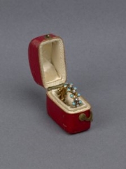
Say you’re a jewelry maker. The majority of your posts should have a photo of your work. But photo after photo of your products, gorgeous though they may be, could lead to more scrolling and less stopping as time goes on. How about shaking things up with a how-cool-is-this post featuring a photo of the engagement ring poet Percy Bysshe Shelley gave to his wife, Harriet Westbrook?

If you’re a brewer of craft beer, you’ll hit a bonanza of beer-related images at the NYPL: prints of beer halls, brewers’ guides from the 1800s, Art Deco ads, a photo of a man loading cases into a Model T truck, even a photo of the 1932 Beer Parade in New York City. (A collection of these images is on my Tumblr blog, Seeing Vintage.) Let the images inspire a bit of research. With the brewer’s guide, post about how many breweries it lists in your state compared with how many there are now. And what was the Beer Parade all about?

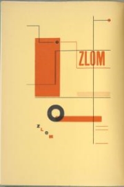
Graphic designers can find inspiration in early 20th century magazine or book covers. Give your followers a bit of history about avant garde design, the history of fonts such as Caslon or using type in design. Talk about what you like about a certain design. The collection of Soviet-era book jackets will have design geeks geeking out. (Check out Seeing Vintage for examples.)

For nonprofits whose work involves STEM (Science, Technology, Engineering and Math) in education, there is an enormous amount of images related to astronomy, biology and architecture.

jazz singer alberta hunter

jazz singer alberta hunter

The NYPL collection is especially deep on theater and African American history. There’s also plenty of fashion, travel photos of exotic places, and prints of plants and animals. If you come across a quote you like, run a quick search to see if there is a photo or portrait of the person who said it, and use it for a meme.

The grouping of images can also be entertaining. Interior designers or plumbers might find “Modern plumbing no. 6” riveting. If you’re a theater company, check out “Photographs of actors who played Hamlet.”

The antique and vintage look of the NYPL images won’t suit every business or all audiences; that’s an aesthetic choice you have to make. If you’re curious about how these images might look on your pages, start by checking out my Tumblr, Seeing Vintage. I’ll be updating it regularly with images I find and some in my collection. That means I’ll be opening up my own cabinet of curiosities to reveal what interests and inspires me.

So, what’s in your cabinet?


NOTES AND TIPS

Tips for searching the NYPL collection

Unless you are as obsessive as I am and want to view every page, use keyword searches. I think that feature could be a lot better; some listings could use more keywords. When you find something interesting, look at the other keywords for clues on how to find more of that. Many items come with interesting information about the donor or the history of the piece, which is another place to look for keywords to use.

Downloading tips

I would download at 760px rather than the smaller 300px. Different platforms work best with different sizes. Some images are even available to order as art prints.

Copyrights and fair use

As quick and easy as it is to take a screenshot, it’s just not OK when you’re using images or artwork under copyright. Artists, writers and other creatives should get credit, and possibly money, for their work. Most of the NYPL images are old enough to not be copyrighted, but there are a few that can’t be used without permission. (Most digital collections I’ve looked at will not allow downloads of copyrighted images.) You should always note where you found the image.

Each collection will have rules for when and how the images can be used and how they should be cited. And cite you must. For blogs or Instagram, you should have room for the full citation. For Facebook, I would use a URL shortener such as bit.ly to link to the image’s page or put the citation in a comment. The NYPL provides exact citation formats in several styles, including MLA, Chicago/Turabian format and APA, as well as Wikipedia code.

In the NYPL collection, public domain images will say, “Can use without restriction.” If the library is unsure of the copyright, it asks for information on the image. It should be safe to use those images as long as you cite the source. If you only want images labeled public domain, you can check that box before searching.

CITATIONS

Cigarette card: "Do you know the origin of the wedding ring?"
George Arents Collection, The New York Public Library. Do you know the origin of the wedding ring? Retrieved from http://digitalcollections.nypl.org/items/510d47e2-49b9-a3d9-e040-e00a18064a99

Engagement ring given by Percy Bysshe Shelley
Carl H. Pforzheimer Collection of Shelley and His Circle, The New York Public Library. (1811). Engagement ring given to Harriet Westbrook by Percy Bysshe Shelley [view 1] Retrieved from http://digitalcollections.nypl.org/items/91557149-480a-b3a8-e040-e00a18066846

Feigenspan beer poster
The Miriam and Ira D. Wallach Division of Art, Prints and Photographs: Art & Architecture Collection, The New York Public Library. (1895 - 1917).Feigenspan's bock beer. Retrieved from http://digitalcollections.nypl.org/items/510d47e2-90dc-a3d9-e040-e00a18064a99

Zlom (A Czechoslovakian poetry magazine)
Spencer Collection, The New York Public Library. Zlom. (Title page) Retrieved from http://digitalcollections.nypl.org/items/510d47e3-1a19-a3d9-e040-e00a18064a99

Photo of Alberta Hunter in Paris, 1929
Schomburg Center for Research in Black Culture, Photographs and Prints Division, The New York Public Library. (1929). Alberta Hunter in ParisRetrieved from http://digitalcollections.nypl.org/items/99812150-b5c7-0130-93bb-58d385a7bbd0
 

How to Keep Austin Arty

Normal
0


false
false
false

EN-US
JA
X-NONE


<w:LatentStyles DefLockedState="false" DefUnhideWhenUsed="true"
DefSemiHidden="true" DefQFormat="false" DefPriority="99"
LatentStyleCount="276">
<w:LsdE…

LBJ Library Future Forum: Austin’s Creative Class, Affordability and Creative Ecosystem. Photo: Jay Godwin, LBJ Library

Is Austin too far gone?

When it comes to making sure our artists, musicians and actors can afford to live here, that’s a real worry.

Austin’s rising cost of life is hitting the people who make this a city where any night of the week you can find a band worth listening to or a performance worth seeing. We have a creative and vibrant town, but more and more creative people are leaving. They can’t pay the rent. The arts groups that employ them are losing their venues as redevelopment marches on. We have a problem.

Last night I listened to a panel of local arts leaders talk about how we can turn that around, or at least put up some buffers. The LBJ Library Future Forum discussion included John Riedie of Austin Creative Alliance, Frank Rodriguez from the mayor’s office, Jenny Larson of Salvage Vanguard Theater and Shea Little of Big Medium.

Here are some things I heard during the discussion:

  • We’ve taken it for granted that Austin is cool and creative, so we’re behind other cities in investing in our cultural ecosystems. Cities such as Denver and Minneapolis began doing that kind of investing 10 years ago, creating cultural districts and subsidizing arts groups. We need to catch up.
     
  • The most pressing issue now is lack of space. We could very well end up with no mid-size black-box theaters like Salvage Vanguard, which recently lost its lease. Artists and performers can’t make money if there are no studios, galleries or theaters. And arts groups can’t pay market rents, especially if they keep their ticket prices low to make them more accessible.
     
  • Austin lacks a solid philanthropic base, and arts nonprofits have not figured out how to work with potential donors in tech and business. Part of the problem is that businesses want brand exposure in exchange for donations, but corporate logos are not exactly “cool.” We need to reframe the conversation from, “What types of marketing/branding things do business donors get?” to saying, "What you get is a cool, exciting city to live in for you and your employees.”
     
  • The city understands that creatives are the “golden goose” and is working on ways to help, including tapping developers and hotel taxes, adjusting building codes for small venues, possibly setting up a “strike fund” for financial support. We can’t place the burden entirely on the city, but we need some government intervention. One example from the past: The city got a bond issue passed to help build Zachary Scott Theater, which leases city land for a nominal fee.
     
  • There’s a perception on the City Council that creatives, especially young people, don’t vote in city elections. (It will be interesting to see whether the Uber/Lyft vote got those folks’ attention, which might drive up turnout.)
     
  • To fight that perception, the entire arts community — music, visual arts, theater, etc. — must do a better job of turning up together at council meetings, public meetings, etc. The creative sector should try to wield the kind of power environmentalists and neighborhood associations do. But we don’t have 10 years to build a movement. We need to act now.
     
  • The main area for small performing and visual arts spaces is East Austin, where we’re seeing gentrification pushing out communities of color. History shows that gentrification tends to start with artists and creatives moving into lower-rent areas, making them cool places that more people want to move to, which pushes up costs. Gentrification in Austin has also been driven by longtime environmental concerns, which caused the city to focus on getting people to move downtown instead of out over the aquifer. The question is, can we have diversity and integration while we focus on protecting arts venues in East Austin?
     
  • We need to move beyond the Old vs. New Austin narrative and focus on making things better, not on how they used to be. Some newer residents feel like they’re seen as the enemy. Being welcoming to new residents and tourists will strengthen the arts community by expanding audiences and gaining political allies, including donors.
     
  • The good news is that Austin is full of creatives who are making quality art. The audiences are turning up. The city is working on solutions. The Arts and Music commissions are working together. The council passed the Austin Music and Creative Omnibus Resolution, which directed the city to come up with proposals for addressing affordability and other issues. The city has responded with a set of proposals. Arts groups such as the Austin Creative Alliance have come up with their proposals. Everyone’s talking. Things seem to be moving forward.
     
  • While we need to keep talking about this issue, we shouldn’t focus so much on the big issues that we lose theaters in the process. It’s truly a watershed moment.

So, what can you do? Buy a ticket. Buy art. Go see a band. Open the Chronicle and find something to do you never thought of before. And show up when we need a show of hands supporting the arts.


"Curate" — Annoying or Really Annoying?

PHOTO: "FLOATING HEADS" BY SOPHIE CAVE, KELVINGROVE MUSEUM, GLASGOW, SCOTLAND. BY LISA WYATT ROE, 2015.

PHOTO: "FLOATING HEADS" BY SOPHIE CAVE, KELVINGROVE MUSEUM, GLASGOW, SCOTLAND. BY LISA WYATT ROE, 2015.

Digital content. Hotel minibars. Cheese plates. Photos of beards. They’re all things I’ve recently seen described as “curated.” Doesn’t it seem like there’s way too much “curating” going on now?

Once used mainly in the realm of museums or art collections, “curate” is now applied to just about any list or collection of things. The New York Times noted this trend back in 2009. I’d say it’s a trend that’s only gotten bigger.

Too big. “Curate” is everywhere in digital and marketing content. Not only is it overused, it’s been tagged as hipster-speak, provoking much eye-rolling in the non-hipster demographic.

So let’s talk about what the word means, why eyes might roll, and whether it’s a word to keep or toss from your content.

What does it mean?

Traditionally, people have “curated” museums or exhibits, but even with museums it can have different meanings. In some museums, the curator is an administrator who oversees the care of the collection. In others, that person might be the conservator, and the curator would be an expert who chooses items to be exhibited.

Now, we use “curate” to imply that an expert or a person with good taste has taken the time to collect, think about and present only the best of something.

What’s the problem?

The problem is many people have a problem with it. Using “curate” in a nontraditional way irks some people, but that’s not the main issue. It’s that we can’t get away from it. I asked a few word nerds what they think about “curate.” Their responses:

“Precious.”

“Pretentious.”

“Reached an obscene level of overuse.”

“Like fingernails on a chalkboard.”

“I roll my eyes so hard.”

And the worst one:

“When I see it, I stop reading.”

That’s exactly the opposite of what you want to happen with your content.

Then there was, “OK, but is it true?”

“Curate” can spark skepticism. When a developer quoted in a news story said a remodeled shopping center “will be a curated center with a thoughtful tenant mix that offers new and different experiences,” I did roll my eyes. It’s hard to imagine a landlord turning down a lucrative long-term lease from, say, a less-than-cool dollar store. I don’t believe it’s true.

Add a redundant “carefully” or “thoughtfully,” and you might push readers fond of the English language one adverb too far.

“I challenge you to use ‘carelessly curated,’ ” said an editor. I love a good writing challenge, but that’s not one I can win.

What can we do instead?

As always, that depends on your audience. One thing to think about is age. Judging by how often it’s used, “curating” is not a problem for digital natives, Millennials, Generation Whatevers  — let’s just say people in their 30s and younger. Age isn’t always a useful way to segment an audience, but it’s likely there’s an age divide at work here. How immersed your audience is in the tech world is another.

If you decide your audience would prefer not to see “curate” in your content, here’s how you can avoid it.

1. Find a different word.

“Pick.” “Select.” “Choose.” “Put together.” Maybe even pop an adverb in there — “thoughtfully,” carefully” or “purposefully” — because these synonyms do not connote care on their own. Your sentence might benefit from a little punch.

There are synonyms I would avoid, however. “Edited” sounds too technical and might imply there was something wrong that was fixed. “Culled” just sounds ugly. It implies something bad was eliminated, and it’s associated with sick animals removed from a herd. That’s not a picture you want to paint for your readers.

2. Be specific.

I know a travel writer who was exasperated by a hotel’s press release touting its “locally curated” minibar. First, “locally curated” says the decisions were made locally, not the intended meaning of containing products made locally. Second, “curated” here sounds pretentious, as if curating an art exhibition is on par with choosing snacks. Think about listing the details instead: locally brewed beer; California wines; Austin-made treats.

3. Just leave it out.

Sometimes all you need to say is something like, “Here’s a list.”

What’s the word on this word?

The word “curate” is not without merit. It’s succinct — always a good thing. It packs some extra meaning without an adverb, words that get little love from writing teachers and editors. And it may be something your audience expects and wants to see.

The 2009 New York Times story suggests that not using “curate” has consequences. If all the rival nightclub promoters are “curating” parties, says a lexicographer quoted in the story, you don’t want to be the one left “hosting” one. For some audiences, not “curating” can be uncool.

I think now, seven years after that story, “curate” is so overused even cool people are rolling their eyes.

But we don’t need to toss it completely. The best use of “curate” is with content — meaning you’ve thought about, read through and chosen a list of blogs, articles or photos, for example, that are worth your audience’s time.

Just make sure it’s true. You lose credibility if you imply you carefully selected content unless you really did whittle down many choices to a reasonable number. Don’t be like Buffer with their “Top 100 Blogs to Curate for Social Media Power Users.” A list with 100 of anything on it suggests there’s more promoting than curating going on.

My take: Use “curate” judiciously and only when it’s accurate and appropriate for your audience.

When it comes to things that might make you sound pretentious to your audience — cheese plates, playlists, beer, an Instagram feed, photos of beards — look for another solution.

Curate your own list of “curate” alternatives, and you’ll keep readers’ eyes on your content — without the eye rolls.